Plotting earthquake data
Since 4th September 2010 we have had over 2, 800 quakes (considering only magnitude 3+) in Christchurch. Quakes come in swarms, with one or few strong shocks, followed by numerous smaller ones and then the ocasional shock, creating an interesting data visualization problem. In our case, we have had swarms in September 2010, December 2010, February 2011, June 2011 and December 2011.
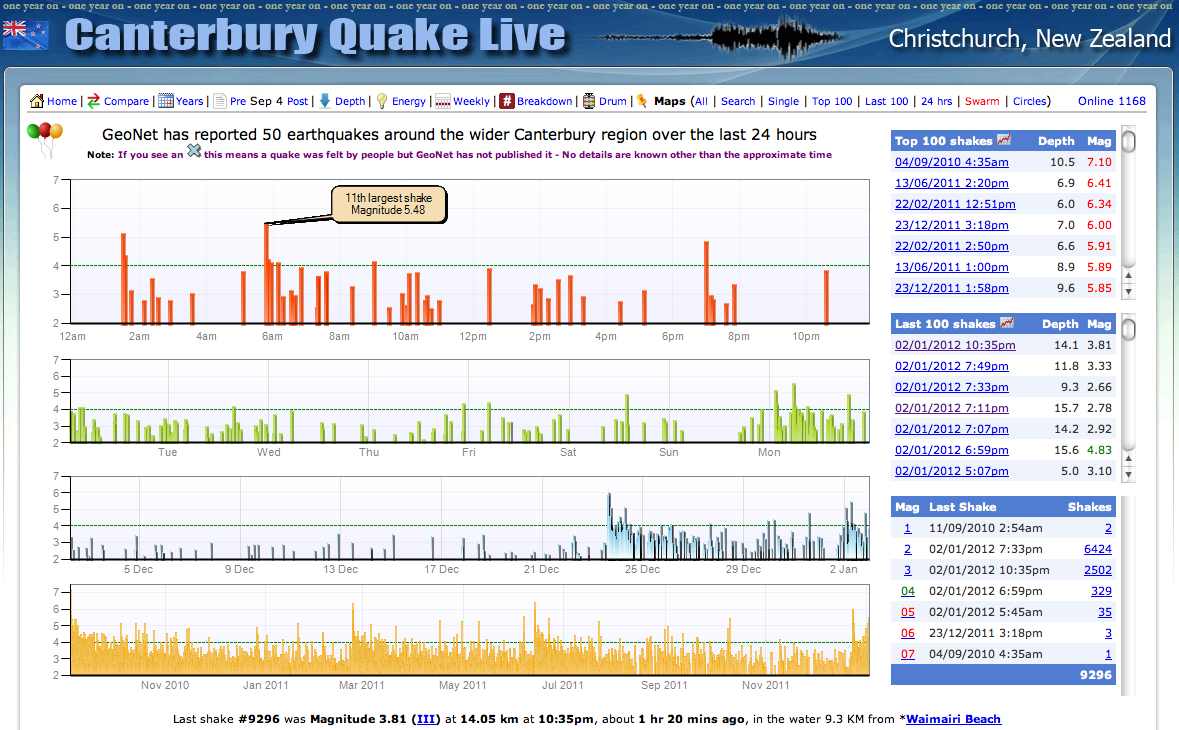
Geonet provides the basic information and there have been several attempts at displaying the full set of shocks. For example, Christchurch Quake Map uses animation, while Canterbury Quake Live uses four panels showing quakes for last 24 hours, last week, last month and since September 2010. While both alternatives are informative, it is hard to see long-term trends due to overplotting, particularly when we move beyond one week during a swarm.
Geonet allows data extraction through forms and queries. Rough limits for the Christchurch earthquakes are: Southern Latitude (-43.90), Northern Latitude (-43.15), Western Longitude (171.75) and Eastern Longitude (173.35). We can limit the lower magnitude to 3, as shocks are hard to feel below that value.
The file earthquakes.csv contains 2,802 shocks, starting on 2010-09-04. The file can be read using the following code:
setwd('~/Dropbox/quantumforest')
library(ggplot2)

# Reading file and manipulating dates
qk <- read.csv('earthquakes.csv', header=TRUE)

# Joins parts of date, converts it to UTC and then
# expresses it in NZST
qk$DATEtxt <-  with(qk, paste(ORI_YEAR,'-',ORI_MONTH,'-',ORI_DAY,' ',
                    ORI_HOUR,':',ORI_MINUTE,':',ORI_SECOND, sep=''))
qk$DATEutc <- as.POSIXct(qk$DATEtxt, tz='UTC')
qk$DATEnz <- as.POSIXct(format(qk$DATEutc, tz='Pacific/Auckland'))
head(qk)
The following code produces a plot that, in my opinion, presents a clearer idea of the swarms but that I still feel does not make justice to the problem.
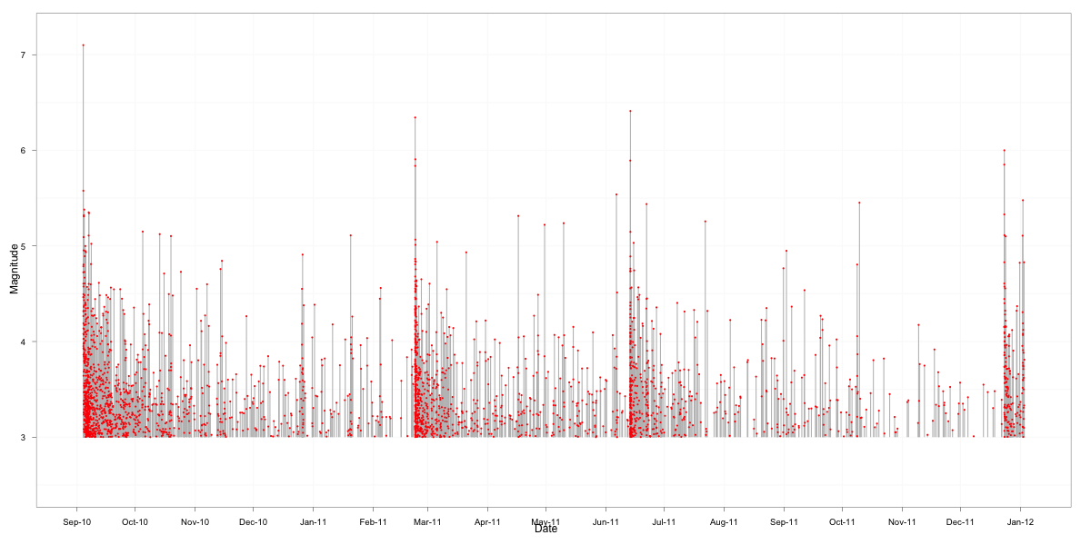
Please let me know if you have a better idea for the plot.
P.S.1 If you want to download data from Geonet there will be problems reading in R the resulting earthquakes.csv file, because the file is badly formed. All lines end with a comma except for the first one, tripping R into believing that the first column contains row names. The easiest way to fix the file is to add a comma at the end of the first line, which will create an extra empty variable called X that is not used in the plots.
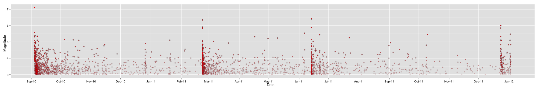
P.S.2 We had some discussions by email with Michael MacAskill (who commented below), where he suggested dropping the grey lines and using alpha less than one to reduce plotting density. I opted for also using an alpha scale, so stronger quakes are darker to mimic the psychology of ‘quake suffering’: both frequent smaller quakes and the odd stronger quakes can be distressing to people. In addition, now the plot uses a 1:6 ratio.
png('earthquakesALPHA.png',height=300, width=1800)
  qplot(DATEnz, MAG, data = qk, alpha = MAG) +
    geom_point(color = 'red', size=1.5) +
    scale_x_datetime('Date', major='month') +
    scale_y_continuous('Magnitude') +
    opts(legend.position = 'none',
         axis.text.x = theme_text(colour = 'black'),
         axis.text.y = theme_text(colour = 'black'))
dev.off()
I ran out of time, but the background needs more work, as well as finding the right level of alpha to best tell the story.