Evolving notes, images and sounds by Luis Apiolaza

If you have to use circles…

Stats Chat is an interesting kiwi site—managed by the Department of Statistics of the University of Auckland—that centers around the use and presentation of statistics in the media. This week there was an interesting discussion on one of those infographics that make you cringe:
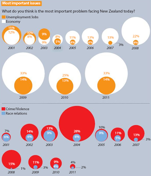
I understand the newspaper’s need to grab our attention, as well as the designer’s esthetical considerations, but they have to follow avoiding misleading the reader and providing at least a ball-park idea of the importance of whatever issue is under discussion. Clearly, as pointed out in the discussion, a line chart would convey the message with a minimum of ink; however, the designer may still want to use circles, and here we could go back to a faceted version of the always maligned pie chart.
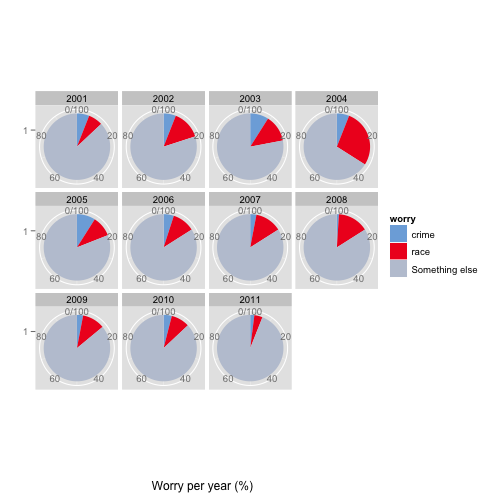
Faceted pie charts using ggplot2

The code reads the data, reshapes it and plots it using pretty much the explanation for pie charts in the ggplot2 documentation.

[gist id=1833838]

Again, please remember my typical disclaimer about lack of design and color flair. Colors and scales need work, but I think it is an improvement over the original.

8 Comments

  1. Jon Peltier

    You replaced those hideous circles with pie charts? You shouldn’t encourage people who don’t know any better.

    You should have ended with “Clearly, as pointed out in the discussion, a line chart would convey the message with a minimum of ink;”, changed the semicolon to a period, and deleted the rest.

    • Luis

      It is called compromise; the same reason why I sometimes use Excel to deal with files coming from students instead of telling them to use real software.

      In addition, the graph has a neat feature: you can see without referring to any scale that the sum of both crime and race relations worry less than a quarter of the people (most of the time). The perfect is the enemy of the good, and we may get a degree of improvement instead of none.

  2. Robert Young

    Standard mantra is that the Pie Chart is evil incarnate, but this use does make sense, if designers are allowed to run the place and insist on something that resembles their elegant “design”.

  3. Tom

    The anti-pie movement is waaaaaaayyyy over-rated. Just know in taking this stance there is no guarantee that Edward Tufte will attend your birthday party.

    • Madelaine Gogol

      LIKE

    • Luis

      But you are welcome to my birthday instead!

  4. Mario

    Well, it’s just a matter of taste. No need to get emotionally stuck. But I’d like to see one improvement: how do you show percentages within / or at the edge of the circle segments?

    • Luis

      Hi Mario, the short answer is “I’ll have to look it up”, I don’t know what is Hadley’s magic to achieve that.

© 2024 Palimpsest

Theme by Anders NorenUp ↑