Suicide statistics and the Christchurch earthquake
Suicide is a tragic and complex problem. This week New Zealand’s Chief Coroner released its annual statistics on suicide, which come with several tables and figures. One of those figures refers to monthly suicides in the Christchurch region (where I live) and comes with an interesting comment:
Suicides in the Christchurch region (Timaru to Kaikoura) have risen from 67 (2010/11) to 81 (2011/12). The average number of suicides per year for this region over the past four years is 74. The figure of 67 deaths last year reflected the drop in suicides post-earthquake. The phenomenon of a drop in the suicide rate after a large scale crisis event, such as a natural disaster, has been observed elsewhere. [my emphasis]
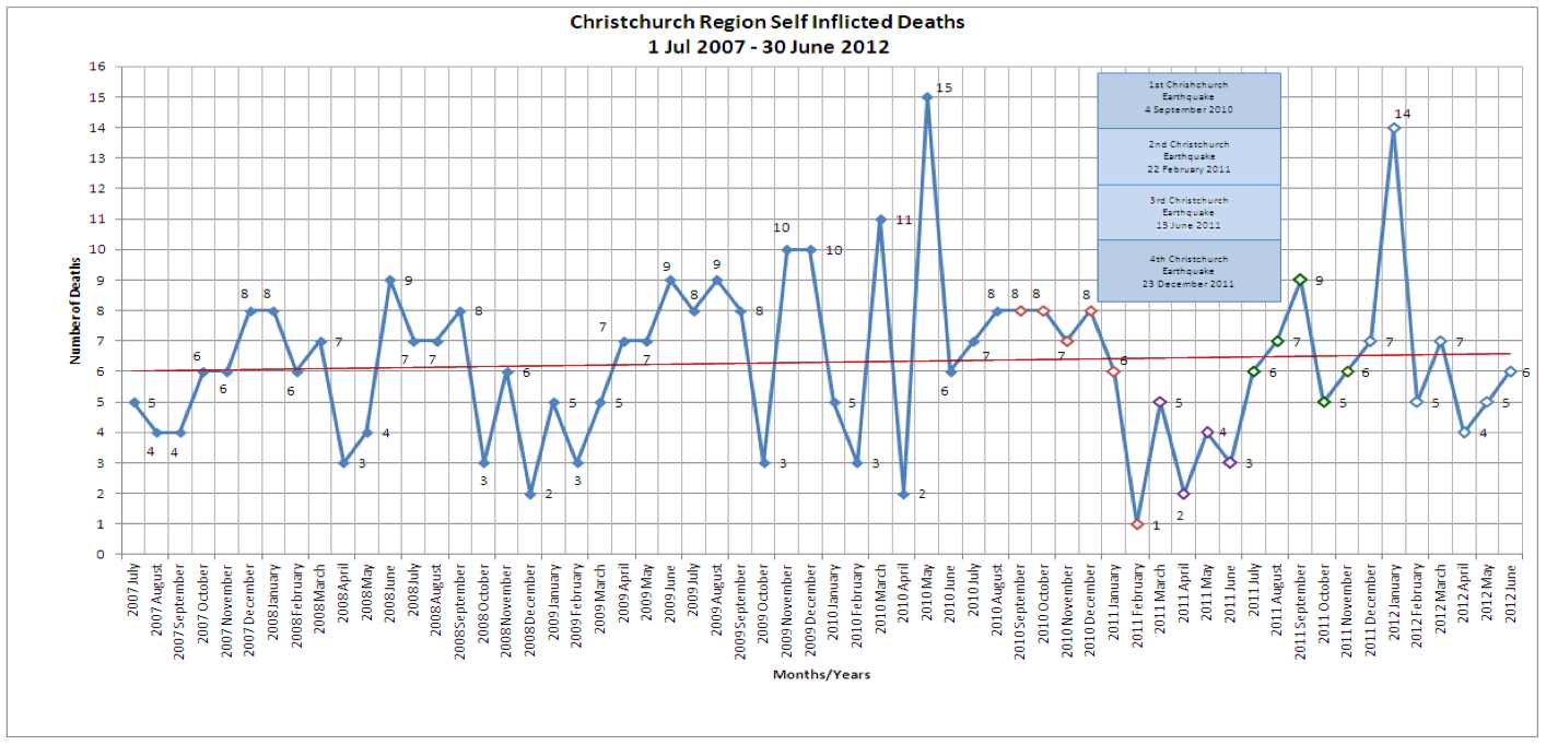
The figure highlights the earthquake and its major aftershocks using different colors. It is true that we have faced large problems following the 4th September 2010 earthquake and thousands of aftershocks, but can we really make the coroner’s interpretation (already picked up by the media)? In fact, one could have a look at the data before the earthquake, where there are big drops and rises (What would be the explanation for that? Nothing to do with any earthquake). In fact, the average number of suicides hasn’t really changed after the quake.
I typed the data in to this file, calculated the mean number of suicides per month (~6.3) and generated a few random realizations of a Poisson process using that mean; here I’m plotting the real data in panel 1, and 4 other randomly generated series in panels 2 to 5.
library(lattice)
su <- read.csv('suicide-canterbury-2012.csv')

su$Day <- ifelse(Month %in% c(1, 3, 5, 7, 8, 10, 12), 31,
                 ifelse(Month %in% c(4, 6, 9, 11), 30, 28))
su$Date <- as.Date(paste(Day, Month, Year, sep = '-'), format = '%d-%m-%Y')

# No huge autocorrelation
acf(su$Number)

# Actual data
xyplot(Number ~ Date, data = su, type = 'b')

# Mean number of monthly suicides: 6.283
# Simulating 4 5-year series using Poisson for
# panels 2 to 5. Panel 1 contains the observed data
simulated <-  data.frame(s = factor(rep(1:5, each = 60)),
                         d = rep(su$Date, 5),
                         n = c(su$Number, rpois(240, lambda = mean(su$Number))))

xyplot(n ~ d | s, simulated, type = 'b', cex = 0.3, layout = c(1, 5),
       xlab = 'Date', ylab = 'Suicides per month')
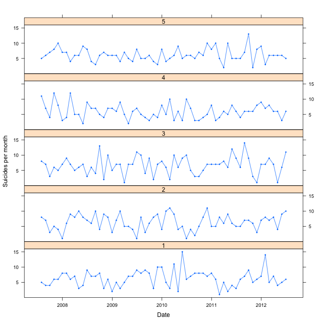
Do they really look different? We could try to fit any set of peaks and valleys to our favorite narrative; however, it doesn’t necessarily make any sense. We’ll need a larger data set to see any long-time effects of the earthquake.
P.S. 2012-09-18. Thomas Lumley comments on this post in StatsChat.