I like the idea of having data on school performance, not to directly rank schools—hard, to say the least, at this stage—but because we can start having a look at the factors influencing test results. I imagine the opportunity in the not so distant future to run hierarchical models combining Ministry of Education data with Census/Statistics New Zealand data.
At the same time, there is the temptation to come up with very simple analyses that would make appealing newspaper headlines. I’ll read the data and create a headline and then I’ll move to something that, personally, seems more important. In my previous post I combined the national standards for around 1,000 schools with decile information to create the standards.csv file.
library(ggplot2)

# Reading data, building factors
standards <- read.csv('standards.csv')
standards$decile.2008 <- factor(standards$decile.2008)
standards$electorate <- factor(standards$electorate)
standards$school.type <- factor(standards$school.type)

# Removing special schools (all 8 of them) because their
# performance is not representative of the overall school
# system
standards <- subset(standards,
                    as.character(school.type) != 'Special School')
standards$school.type <- standards$school.type[drop = TRUE]

# Create performance variables. Proportion of the students that
# at least meet the standards (i.e. meet + above)
# Only using all students, because subsets are not reported
# by many schools
standards$math.OK <- with(standards, math.At + math.A)
standards$reading.OK <- with(standards, reading.At + reading.A)
standards$writing.OK <- with(standards, writing.At + writing.A)
Up to this point we have read the data, removed special schools and created variables that represent the proportion of students that al least meet standards. Now I’ll do something very misleading: calculate the average for reading.OK for each school decile and plot it, showing the direct relationship between socio-economic decile and school performance.
mislead <- aggregate(reading.OK ~ decile.2008,
                     data = standards, mean)
qplot(decile.2008, reading.OK , data = mislead)
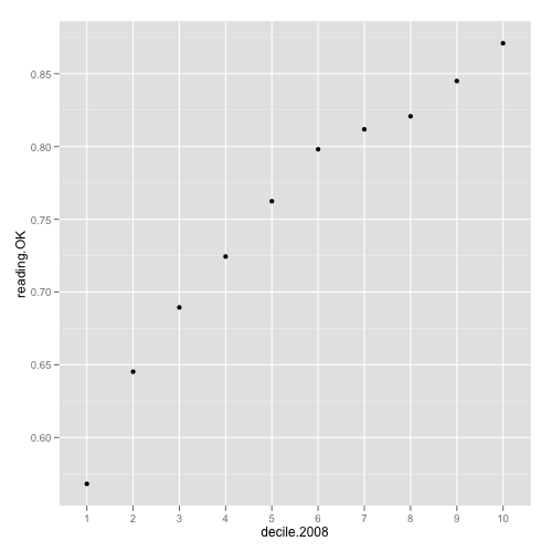
Using only the average strengthens the relationship, but it hides something extremely important: the variability within each decile. The following code will display box and whisker plots for each decile: the horizontal line is the median, the box contains the middle 50% of the schools and the vertical lines 1.5 times the interquantile range (pretty much the range in most cases):
qplot(decile.2008, reading.OK,
      data = standards, geom = 'boxplot',
      xlab = 'Decile in 2008',
      ylab = 'Reading at or above National Standard')
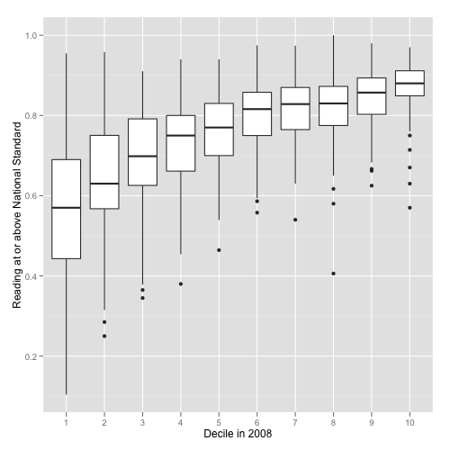
A quick look at the previous graph shows a few interesting things:
- the lower the decile the more variable school performance,
- there is pretty much no difference between deciles 6, 7, 8 and 9, and a minor increase for decile 10.
- there is a trend for decreasing performance for lower deciles; however, there is also a huge variability within those deciles.
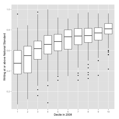
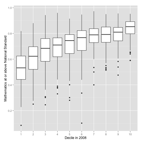
We can repeat the same process for writing.OK and math.OK with similar trends, although the level of standard achievement is lower than for reading:
qplot(decile.2008, writing.OK,
      data = standards, geom = 'boxplot',
      xlab = 'Decile in 2008',
      ylab = 'Writing at or above National Standard')

qplot(decile.2008, math.OK,
      data = standards, geom = 'boxplot',
      xlab = 'Decile in 2008',
      ylab = 'Mathematics at or above National Standard')
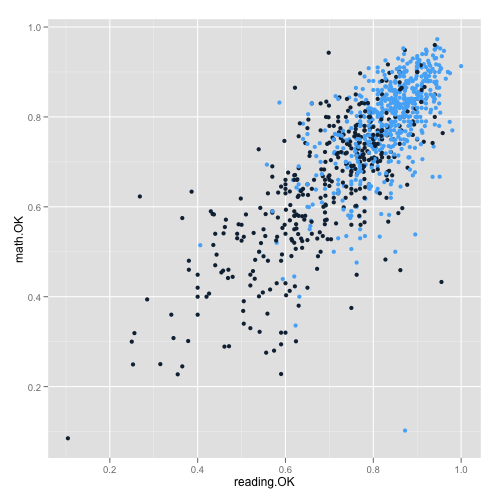
Achievement in different areas (reading, writing, mathematics) is highly correlated:
cor(standards[, c('reading.OK', 'writing.OK', 'math.OK')],
    use = 'pairwise.complete.obs')

#           reading.OK writing.OK   math.OK
#reading.OK  1.0000000  0.7886292 0.7749094
#writing.OK  0.7886292  1.0000000 0.7522446
#math.OK     0.7749094  0.7522446 1.0000000

# We can plot an example and highlight decile groups
# 1-5 vs 6-10
qplot(reading.OK, math.OK,
      data = standards,
      color = ifelse(as.numeric(decile.2008) > 5, 1, 0)) +
opts(legend.position = 'none')
All these graphs are only descriptive/exploratory; however, once we had more data we could move to hierarchical models to start adjusting performance by socioeconomic aspects, geographic location, type of school, urban or rural setting, school size, ethnicity, etc. Potentially, this would let us target resources on schools that could be struggling to perform; nevertheless, any attempt at creating a ‘quick & dirty’ ranking ignoring the previously mentioned covariates would be, at the very least, misleading.
Note 2012-09-26: I have updated data and added a few plots in this post.