More sense of random effects
I can’t exactly remember how I arrived to “Making sense of random effects” (original post is gone), in the Distributed Ecology blog (go over there and read it). Incidentally, my working theory is that I follow Scott Chamberlain (@recology), who follows Karthik Ram ?(@_inundata) who mentioned Edmund Hart’s (@DistribEcology) post. I liked the discussion, but I thought one could add to the explanation to make it a bit clearer.
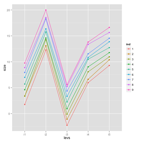
The idea is that there are 9 individuals, assessed five times each—once under each of five different levels for a treatment—so we need to include individual as a random effect; after all, it is our experimental unit. The code to generate the data, plot it and fit the model is available in the post, but I redid data generation to make it a bit more R-ish and, dare I say, a tad more elegant:
library(lme4)
library(ggplot2)

# Basic dataset
idf <- data.frame(ind = factor(rep(1:9, 5)),
                 levs = factor(rep(c('i1', 'i2', 'i3', 'i4', 'i5'), each = 9)),
                 f.means = rep(c(6, 16, 2, 10, 13), each = 9),
                 i.eff = rep(seq(-4, 4, length = 9), 5))

# Function for individual values used in apply
ran.ind <- function(f.means, i.eff) rnorm(1, f.means + i.eff, 0.3)

# Rich showed me this version of apply that takes more than one argument
# https://smtp.biostat.wustl.edu/sympa/biostat/arc/s-news/2005-06/msg00022.html
# so we skip loops
idf$size <- apply(idf[, 3:4], 1,
                  function(x) do.call('ran.ind', as.list(x)))

ggplot(idf, aes(x = levs, y = size, group = ind, colour = ind)) +
  geom_point() + geom_path()

# Fit linear mixed model (avoid an overall mean with -1)
m3 <- lmer(size ~ levs - 1 + (1 | ind), data = idf)
summary(m3)

# Skipping a few things
#   AIC   BIC logLik deviance REMLdev
# 93.84 106.5 -39.92    72.16   79.84
#Random effects:
# Groups   Name        Variance Std.Dev.
# ind      (Intercept) 7.14676  2.67334
# Residual             0.10123  0.31816
#Number of obs: 45, groups: ind, 9

# Show fixed effects
fixef(m3)

#   levsi1    levsi2    levsi3    levsi4    levsi5
# 5.824753 15.896714  2.029902  9.969462 12.870952

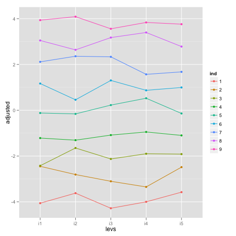
What we can do to better understand what’s going on is ‘adjust’ the score observations by the estimated fixed effects and plot those values to see what we are modeling with the random effects:
# Substract fixed effects
idf$adjusted <- idf$size - rep(fixef(m3), each = 9)

ggplot(idf, aes(x = levs, y = adjusted, group = ind, colour = ind)) +
  geom_point() + geom_path()

# Display random effects
ranef(m3)

#$ind
#  (Intercept)
#1 -3.89632810
#2 -2.83054394
#3 -1.99715524
#4 -1.12733342
#5  0.06619981
#6  0.95605162
#7  2.00483963
#8  2.99947727
#9  3.82479236

The random effects for individual or, better, the individual-level intercepts are pretty much the lines going through the middle of the points for each individual. Furthermore, the variance for ind is the variance of the random intercepts around the ‘adjusted’ values, which can be seen comparing the variance of random effects above (~7.15) with the result below (~7.13).
var(unlist(ranef(m3)))
#[1] 7.12707
Distributed Ecology then goes on to randomize randomize the individuals within treatment, which means that the average deviation around the adjusted means is pretty close to zero, making that variance component close to zero. I hope this explanation complements Edmund Hart’s nice post.
P.S. If you happen to be in the Southern part of South America next week, I’ll be here and we can have a chat (and a beer, of course).