Being data curious: the strange case of lamb consumption in NZ
There is a lot of talk about the skills needed for working in Statistics/Data Science, with the discussion often focusing on theoretical understanding, programming languages, exploratory data analysis, and visualization. There are many good blog posts dealing with how you get data, process it with your favorite language and then creating some good-looking plots. However, in my opinion, one important skill is curiosity; more specifically being data curious.
Often times being data curious doesn’t require statistics or coding, but just searching for and looking at graphs. A quick example comes from Mike Dickinson’s: “This is extraordinary: within a decade, NZers basically stopped eating lamb. 160 years of tradition scrapped almost overnight.”
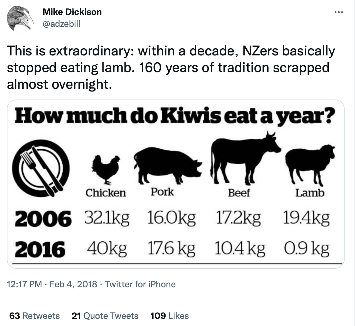
After reading the news article, many people came up with good potential explanations: Have the relative prices changed? Do we have different demographics with not so much appetite for lamb? etc.
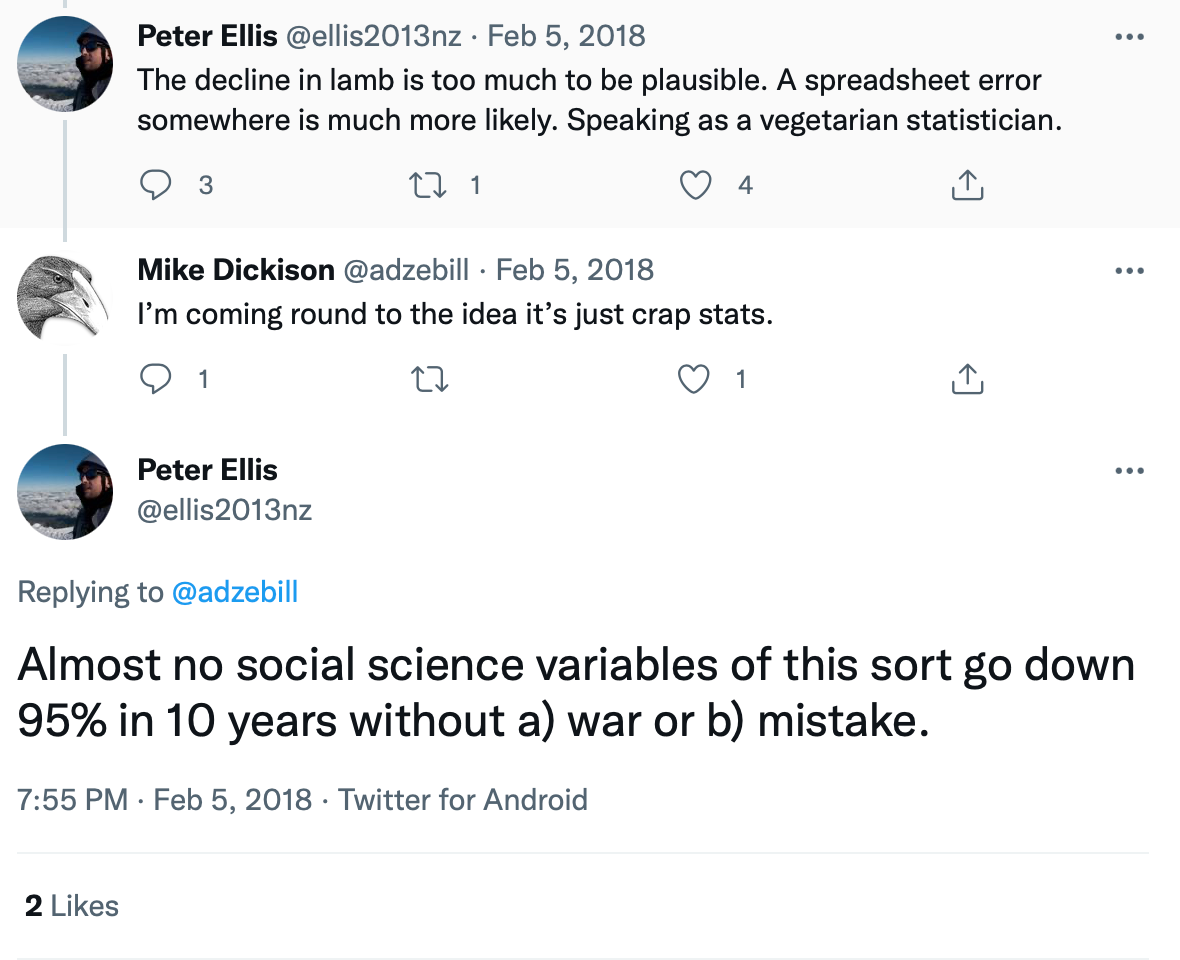
Few comments questioned the data until Peter Ellis voiced exactly what was nagging me:
Do the two data points make sense? In this data-abundant world, it didn’t take long to find the time series from which the points came from in this handy OECD page.
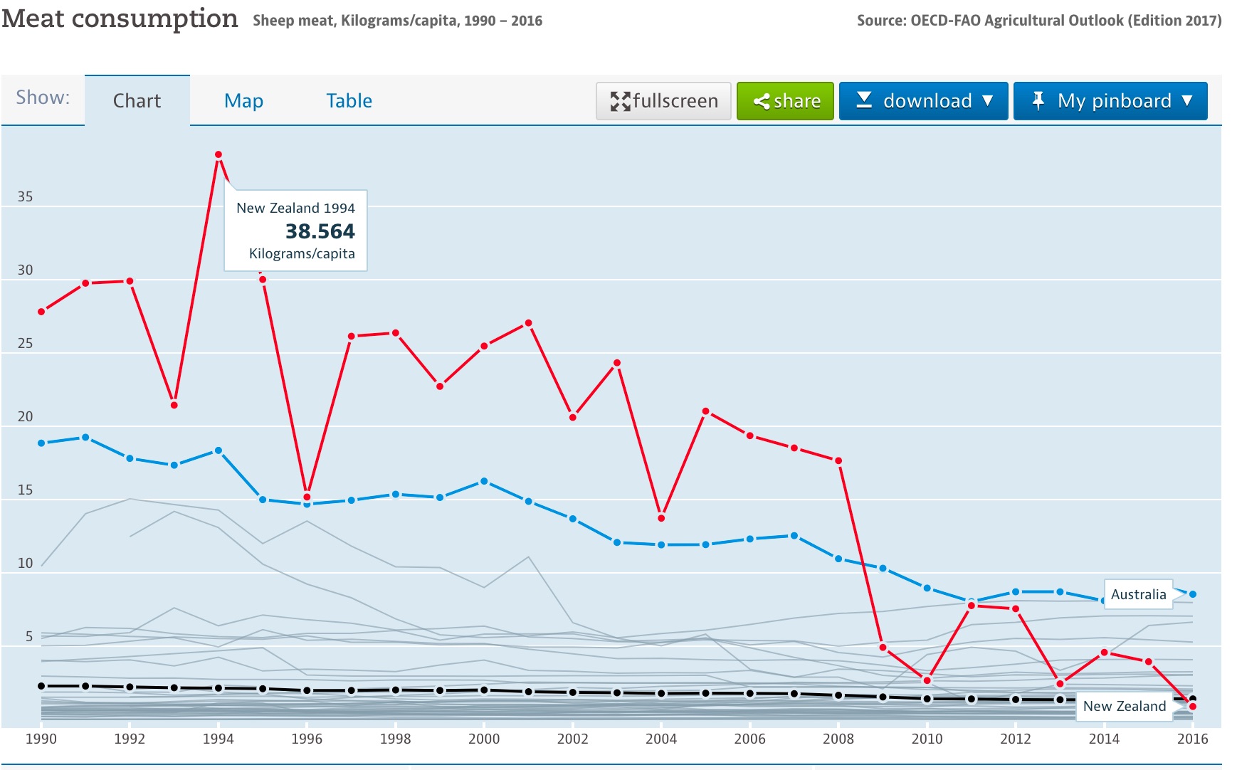
A quick look shows that the series contains both quoted consumption figures, showing the talked-about 10-year decline. Even more surprisingly, one can see that practically most of the decline occurred from 2008 to 2009 (from 17.7 to 4.9 kg/person), which is a bizarre drop for a single year. A single person may have large differences in consumption from one year to the next; however, over a whole country those deviations tend to be averaged out. This highlights another issue with the time series: it wiggles like crazy.
When exploring data is useful to have some sort of benchmark to see if other things are also changing at the same time. I chose our neighbor Australia—with a not so different diet, similar part of the world—as my benchmark. The Australian time series doesn’t show a change like NZ. Besides using the benchmark for the same product, we can also compare what’s going on with other meats. For example, beef and veal, pork and poultry.
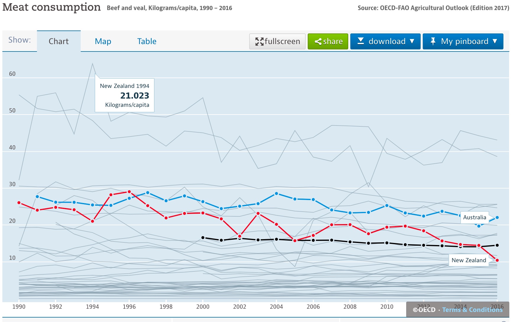
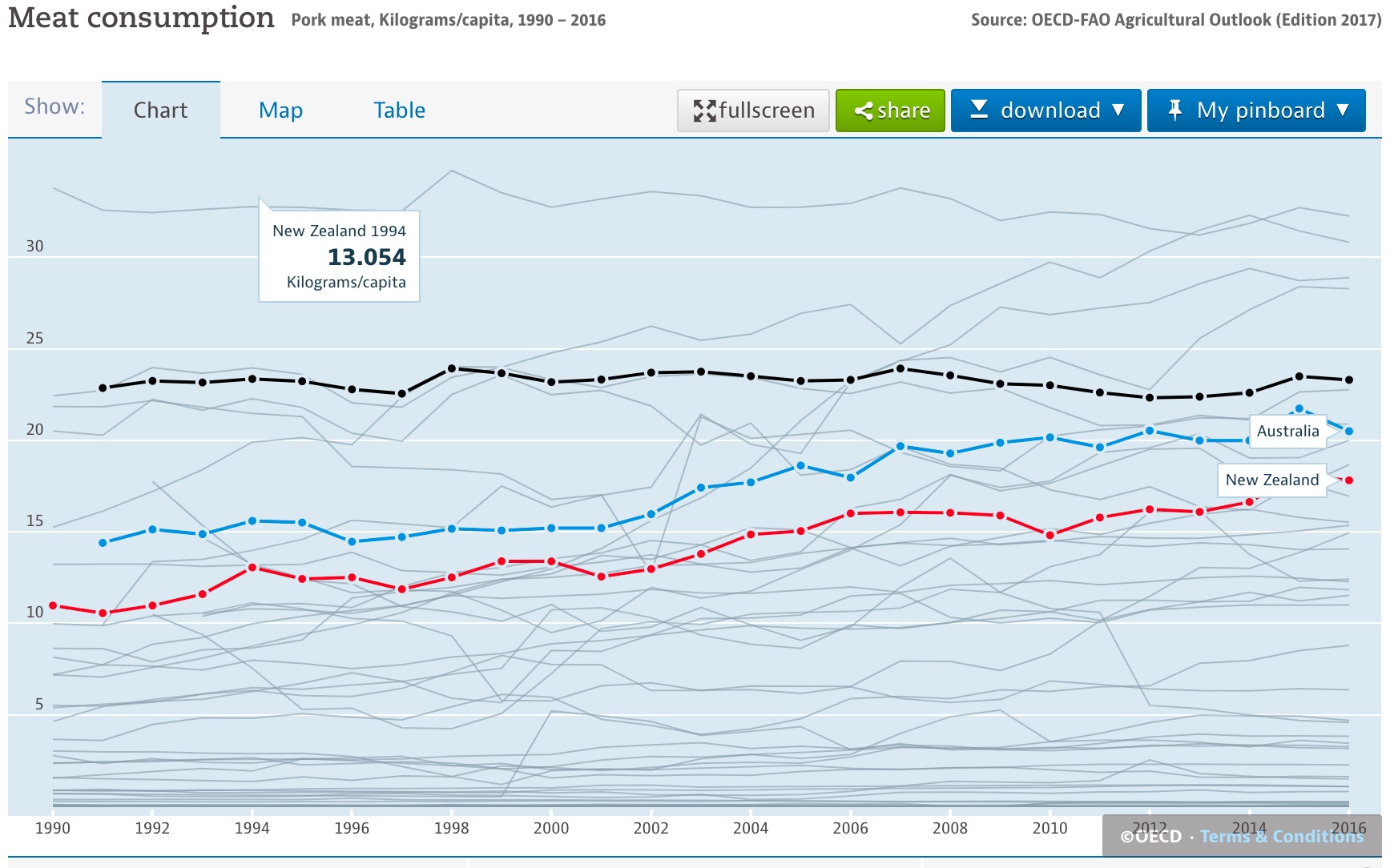
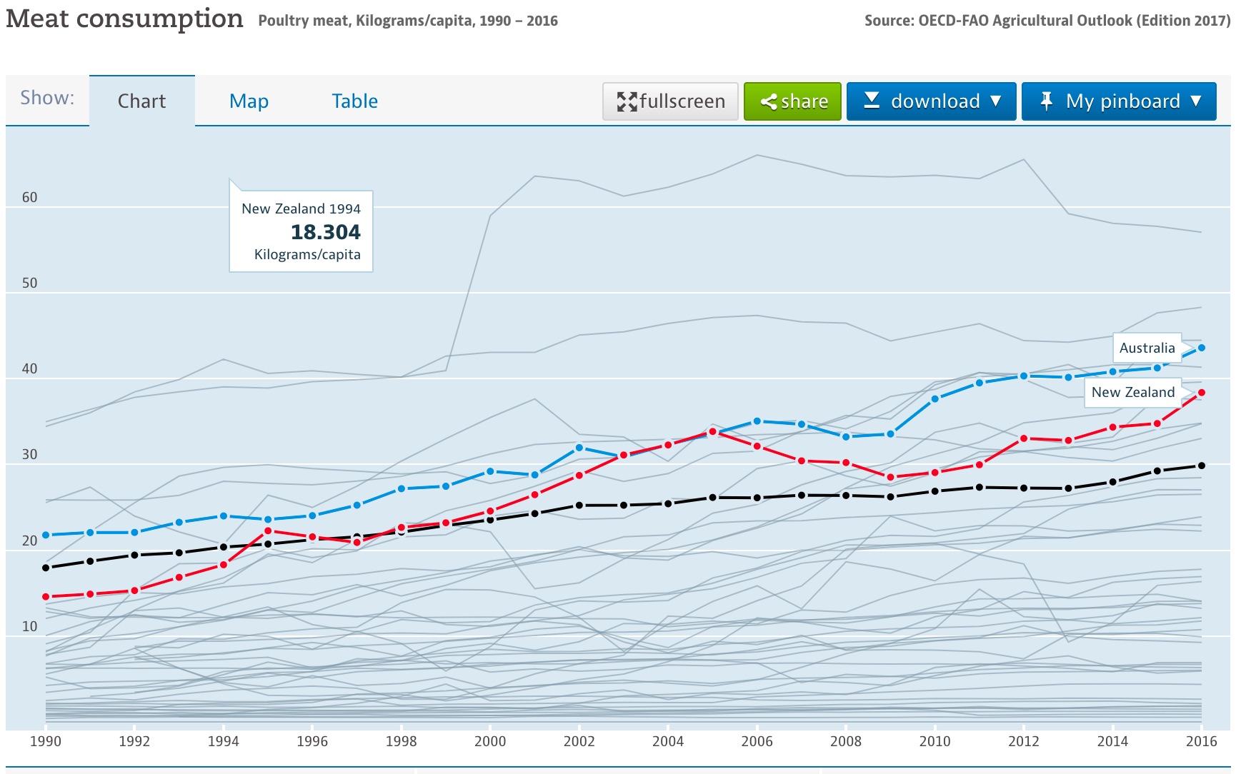
All the series are smoother and show similar trends in Australia and New Zealand, which makes the lamb saga increasingly look like a mistake. We can now move from trying to explain social changes that are driving the change between two numbers, to being highly suspicious about the numbers under discussion!
So where could be the problem coming from? Consumption per capita requires i) total domestic consumption of sheep meat and ii) population of the country. We are pretty sure we have good data for population, courtesy of Statistics New Zealand. How would one go about estimating domestic consumption of sheep meat? Probably one would:
- Get the size of the New Zealand sheep flock. We can get sheep numbers from Statistics NZ Agricultural Production Statistics. Livestock numbers are a national indicator, which tend to have high accuracy.
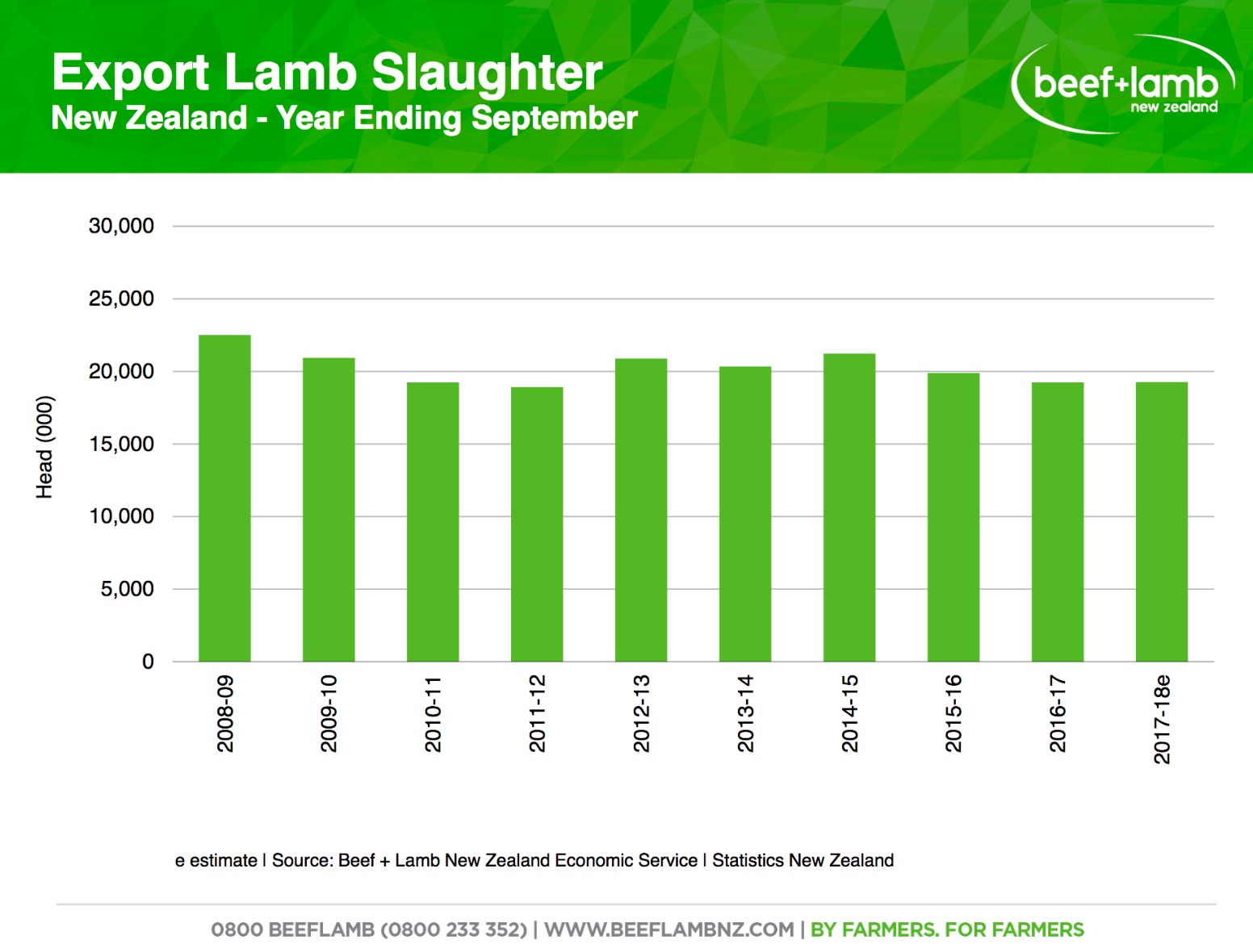
- Get an idea of the proportion of the flock that’s exported, which we know is pretty substantial. I don’t know how good these numbers are, but Beef & Lamb NZ gives us an idea of how many sheep are slaughtered for export. This number, which hovers around 20 million a year seems quite consistent. We have to remember that not the whole population is slaughtered every year, as we have to replace the flock.
- The difference between flock size – (sheep for export + replacement sheep) should be the number of sheep for domestic consumption.
- We need a conversion factor between number of sheep and kg of meat produced, so we can calculate meat consumption/capita.
I would assume that the sheep-meat conversion factor will show little fluctuation from year to year, so perhaps the likely culprit is the penultimate point, estimating the number of sheep for domestic consumption. One thing that grabs my attention is that while the flock is getting smaller, the number of sheep for exports stays around the same, which should mean fewer sheep available for the domestic market, giving credibility to the lower lamb consumption trend.
I don’t know if this the actual explanation for the “lamb consumption crash”. If I had more time I could chase some of the domestic consumption numbers, even call the Beef & Lamb people. But this should be enough to get you started with an example on how to question the news using real data. I’m sure you reader can come up with better ways of looking at this and other stories.
P.S. 2024-12-11 I have deleted the links to the original tweets, as the accounts were deleted.