Mucking around with maps, schools and ethnicity in NZ
I’ve been having a conversation for a while with Harkanwal Singh and Aaron Schiff on maps, schools, census, making NZ data available, etc. This post documents some basic steps I used for creating a map on ethnic diversity in schools at the census-area-unit level. This “el quicko” version requires 3 ingredients:
- Census area units shape files (available from Statistics New Zealand for free here).
- School directory (directory-school-current.csv available here).
- R with some spatial packages (also free).
We’ll read the school directory data, aggregate ethnicity information to calculate the Herfindahl–Hirschman Index of diversity and then plot it.
# School directory
direc <- read.csv('directory-school-current.csv', skip = 3)
# Total number of students for each ethnicity by Census Area Unit
hhi <- aggregate(cbind(European..Pakeha, Maori, Pasifika, Asian, MELAA, Other) ~
Census.Area.Unit, data = direc, FUN = sum, na.rm = TRUE)
# Function to calculate
index <- function(x) {
total <- sum(x, na.rm = TRUE)
frac <- x/total
h <- sum(frac^2)
hn <- if(total > 1) (h - 1/total)/(1 - 1/total) else 1
return(hn)
}
# Calculate the index for each area
hhi$hn <- apply(hhi[,2:7], 1, index)
# Write data to use in QGis later
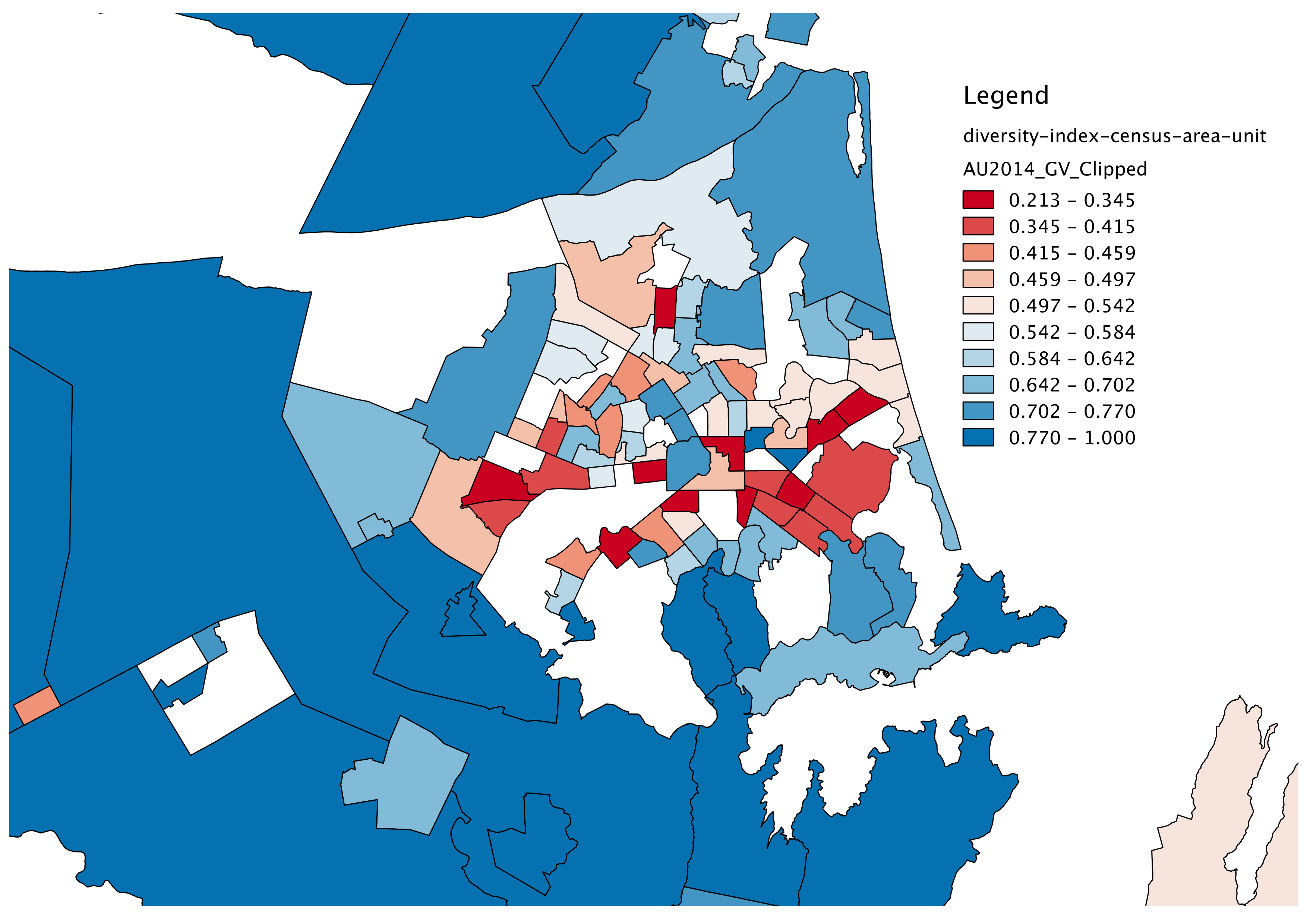
write.csv(hhi, 'diversity-index-census-area-unit.csv',
quote = FALSE,
row.names = FALSE)
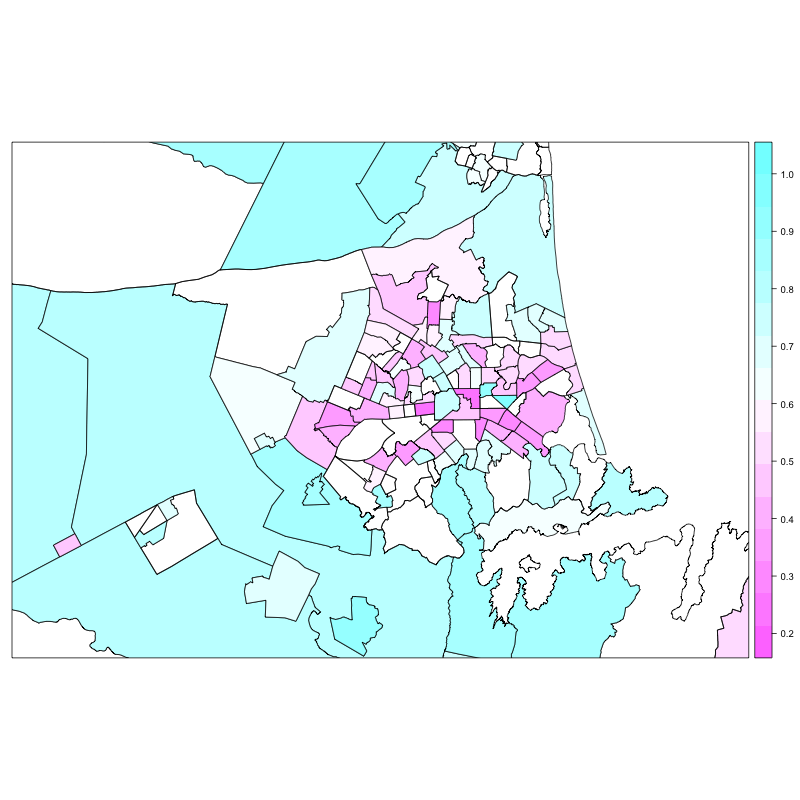
Then I moved to create a map in R, for the sake of it:
library(rgdal) # for readOGR
library(sp)    # for spplot

# Reading shapefile
cau <- readOGR(dsn='/Users/lap44/.../census/2014 Digital Boundaries Generlised Clipped',
               layer='AU2014_GV_Clipped')

# Joining with school ethnicity data (notice we refer to @data, as cau contains spatial info as well)
cau@data <- data.frame(cau@data,
            hhi[match(cau@data[,"AU2014_NAM"], hhi[,"Census.Area.Unit"]),])

# Limiting map to the area around Christchurch
spplot(cau, zcol = "hn", xlim = c(1540000, 1590000),
       ylim= c(5163000, 5198000))
And we get a plot like this:
Just because it is Monday down under.
P.S. Using the diversity-index-census-area-unit.csv and joining it with the shapefile in QGIS one can get something prettier (I have to work on matching the color scales). Map rendering is so much faster in QGIS than in R! Clearly the system has been optimized for this user case.