Lattice when modeling, ggplot when publishing
When working in research projects I tend to fit several, sometimes quite a few, alternative models. This model fitting is informed by theoretical considerations (e.g. quantitative genetics, experimental design we used, our understanding of the process under study, etc.) but also by visual inspection of the data. Trellis graphics—where subsets of data are plotted in different ‘panels’ defined by one or more factors—are extremely useful to generate research hypotheses.
There are two packages in R that have good support for trellis graphics: lattice and ggplot2. Lattice is the oldest, while ggplot2 is probably more consistent (implementing a grammar of graphics) and popular with the cool kids and the data visualization crowd. However, lattice is also quite fast, while ggplot2 can be slow as a dog (certainly way slower than my dog).
Tree-breeding progeny trials often have between 1,000 and 12,000 individuals, and analyses commonly include several trials. Thus, it is not unusual to have tens of thousands or even hundreds of thousand of records that will be involved in the analysis. Add to this situation that I am impatient and you will understand that differences on speed can make a big difference to my mental health. But how different is the speed? We can simulate some correlated data (following the explanation in this post) and build a simple scatterplot faceted by site; let’s say 60,000 observations in 6 sites (10,000 per site).
library(lattice)
library(ggplot2)

# number of observations to simulate
nobs <- 60000
sites <- 6

# Using a correlation matrix (let's assume that all variables
# have unit variance
M <- matrix(c(1, 0.7,
              0.7, 1), nrow=2, ncol=2)

# Cholesky decomposition
L <- chol(M)
nvars <- dim(L)[1]

# Random variables that follow an M correlation matrix
r <- t(L) %*% matrix(rnorm(nvars*nobs), nrow=nvars, ncol=nobs)
r <- t(r)

rdata <- as.data.frame(r)
names(rdata) <- c('x', 'y')
rdata$site <- factor(rep(1:sites, each = nobs/sites))

# Plotting with lattice
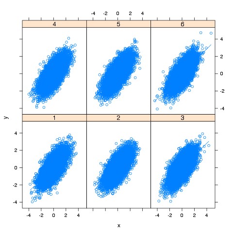
xyplot(y ~ x | site, data = rdata,
       layout = c(3, 2), type=c('p','smooth'))

# Plotting with ggplot2
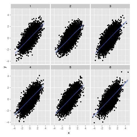
qplot(x, y, facets = ~ site,
      geom = c('point', 'smooth'),
      data = rdata) + facet_wrap(~site)
The timing was done surrounding the graph calls (either xyplot() or qplot()) by system.time(print()), so the graph is sent to the screen and the operation is timed†. In summary, in this simple call ggplot2 takes a bit over double the time than lattice. The more layers you add to the graph the slower it gets.
The two plots are below. We could improve both plots and make them look more similar to each other, but I want to avoid introducing more distractions in the code.


Nevertheless, I do like the flexibility of ggplot2, so I support most of my exploratory data analysis using lattice but when I have to create the final pretty plots for publications in journals I go back to ggplot2. I subscribe to Frank Harrell’s Philosophy of Biostatistics, which includes ‘use excellent graphics, liberally’. Switching between packages let me deal with both abundance of graphics and impatience.
† This is R pitfall #2: plots inside a function (and system.time() is a function) have to be surrounded by print() or they won’t be sent to the screen. Pitfall #1 is here.