A word of caution: the sample may have an effect
This week I’ve tried to i-stay mostly in the descriptive statistics realm and ii-surround any simple(istic) models with caveats and pointing that they are very preliminary. We are working with a sample of ~1,000 schools that did reply to Fairfax’s request, while there is a number of schools that either ignored the request or told Fairfax to go and F themselves. Why am I saying this? If one goes and gets a simple table of the number of schools by type and decile there is something quite interesting: we have different percentages for different types of schools represented in the sample and the possibility of bias on the reporting to Fairfax, due to potential low performance (references to datasets correspond to the ones I used in this post):
summary(standards$school.type)
#         Composite (Year 1-10)          Composite (Year 1-15)        Contributing (Year 1-6)
#                             1                             29                            403
#       Full Primary (Year 1-8)    Intermediate (year 7 and 8) Restricted Composite (Yr 7-10)
#                           458                             62                              1
#         Secondary (Year 7-15)
#                            56
Now let’s compare this number with the school directory:
summary(factor(directory$school.type))
#         Composite (Year 1-10)          Composite (Year 1-15)        Contributing (Year 1-6)
#                             4                            149                            775
#         Correspondence School        Full Primary (Year 1-8)    Intermediate (year 7 and 8)
#                             1                           1101                            122
#Restricted Composite (Yr 7-10)         Secondary (Year 11-15)          Secondary (Year 7-10)
#                             4                              2                              2
#         Secondary (Year 7-15)          Secondary (Year 9-15)                 Special School
#                           100                            238                             39
#              Teen Parent Unit
#                            20
As a proportion we are missing more secondary schools. We can use the following code to get an idea of how similar are school types, because the small number of different composite schools is a pain. If
# Performance of Contributing (Year 1-6) and
# Full Primary (Year 1-8) looks pretty much the
# same. Composites could be safely merged
qplot(school.type, reading.OK,
      data = standards, geom = 'jitter')

qplot(school.type, writing.OK,
      data = standards, geom = 'jitter')

qplot(school.type, math.OK,
      data = standards, geom = 'jitter')

# Merging school types and plotting them colored
# by decile
standards$school.type.4 <- standards$school.type
levels(standards$school.type.4) <- c('Composite', 'Composite', 'Primary',
'Primary', 'Intermediate',
'Composite', 'Secondary')

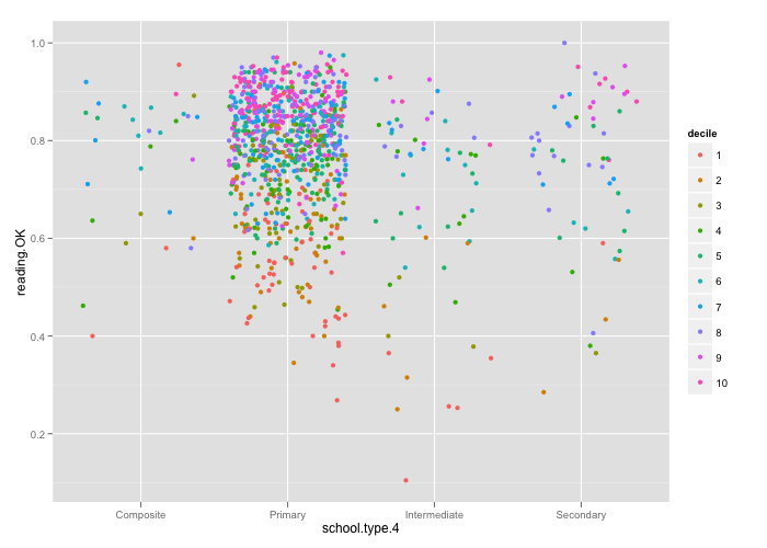
qplot(school.type.4, reading.OK, colour = decile,
      data = standards, geom = 'jitter')


I’m using jittering rather than box and whisker plots to i- depict all the schools and ii- get an idea of the different participation of school types in the dataset. Sigh. Another caveat to add in the discussion.
P.S. 2012-09-27 16:15. Originally I mentioned in this post the lack of secondary schools (Year 9-15) but, well, they are not supposed to be here, because National Standards apply to years 1 to 8 (Thanks to Michael MacAskill for pointing out my error.)